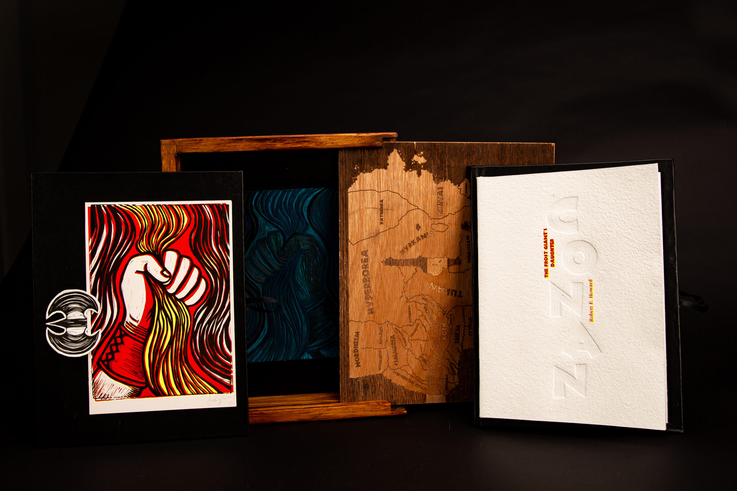
Conan
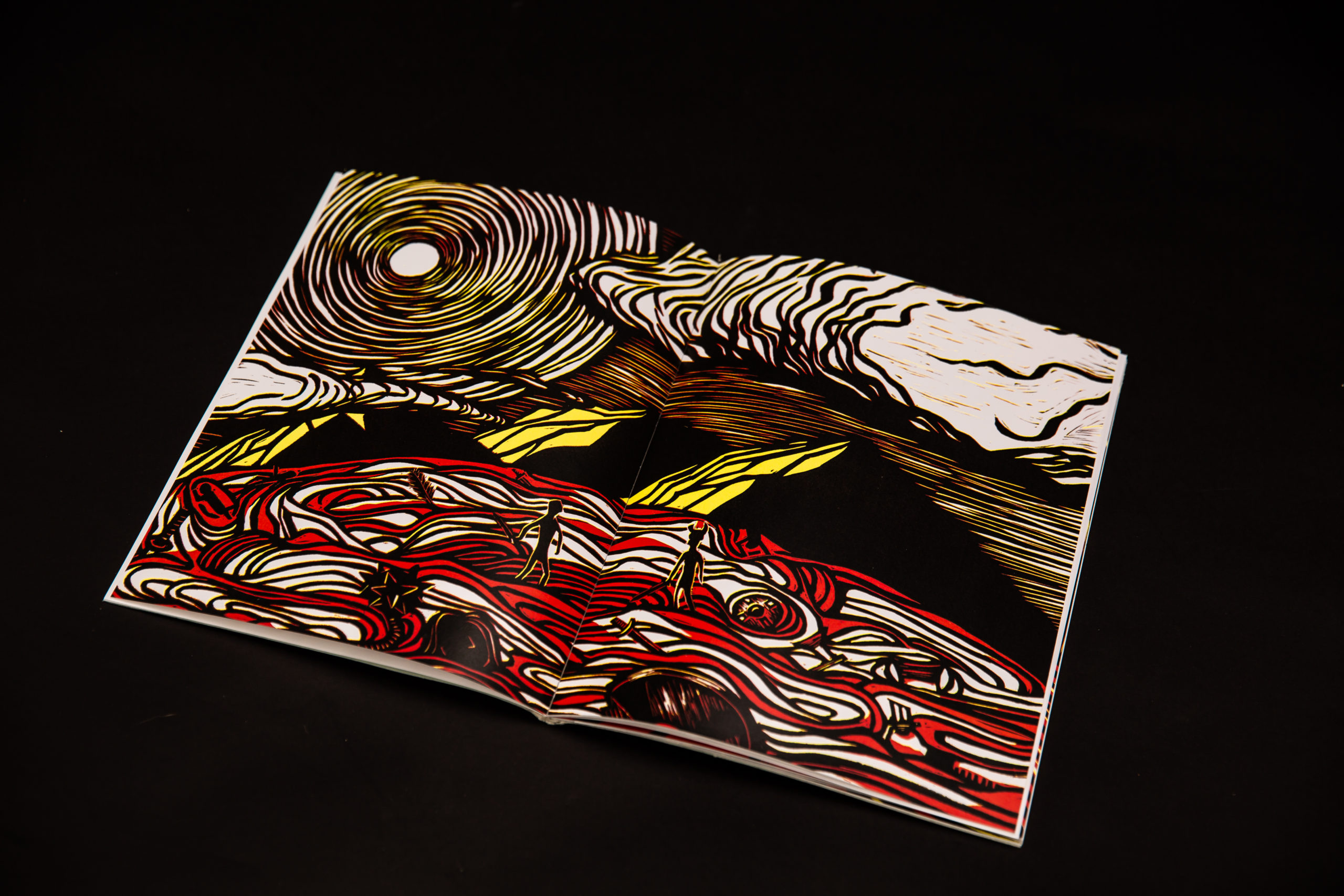
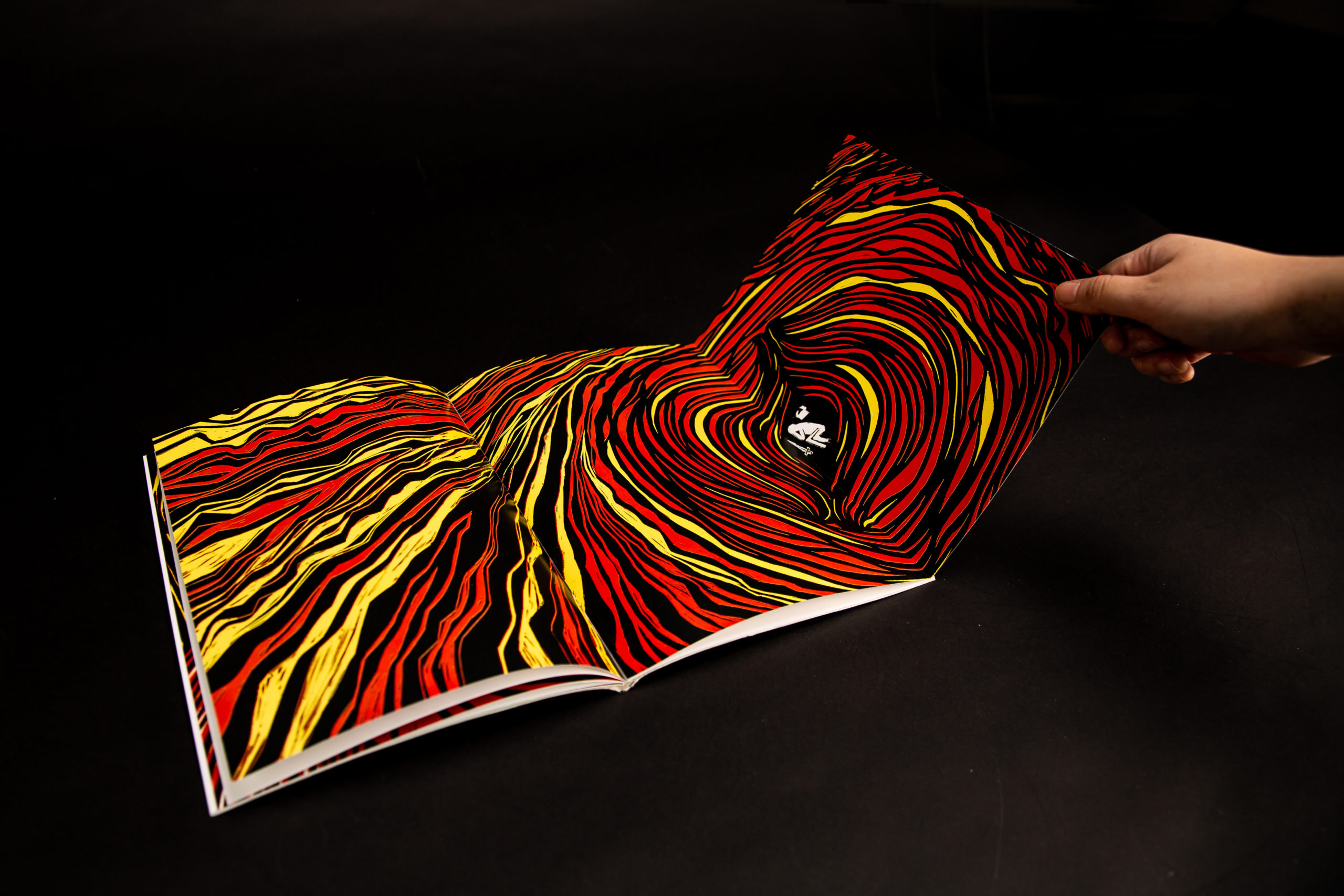
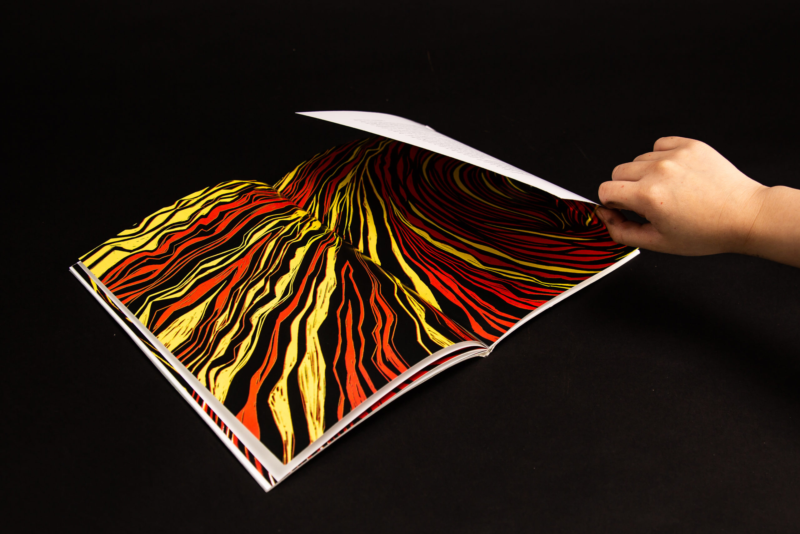
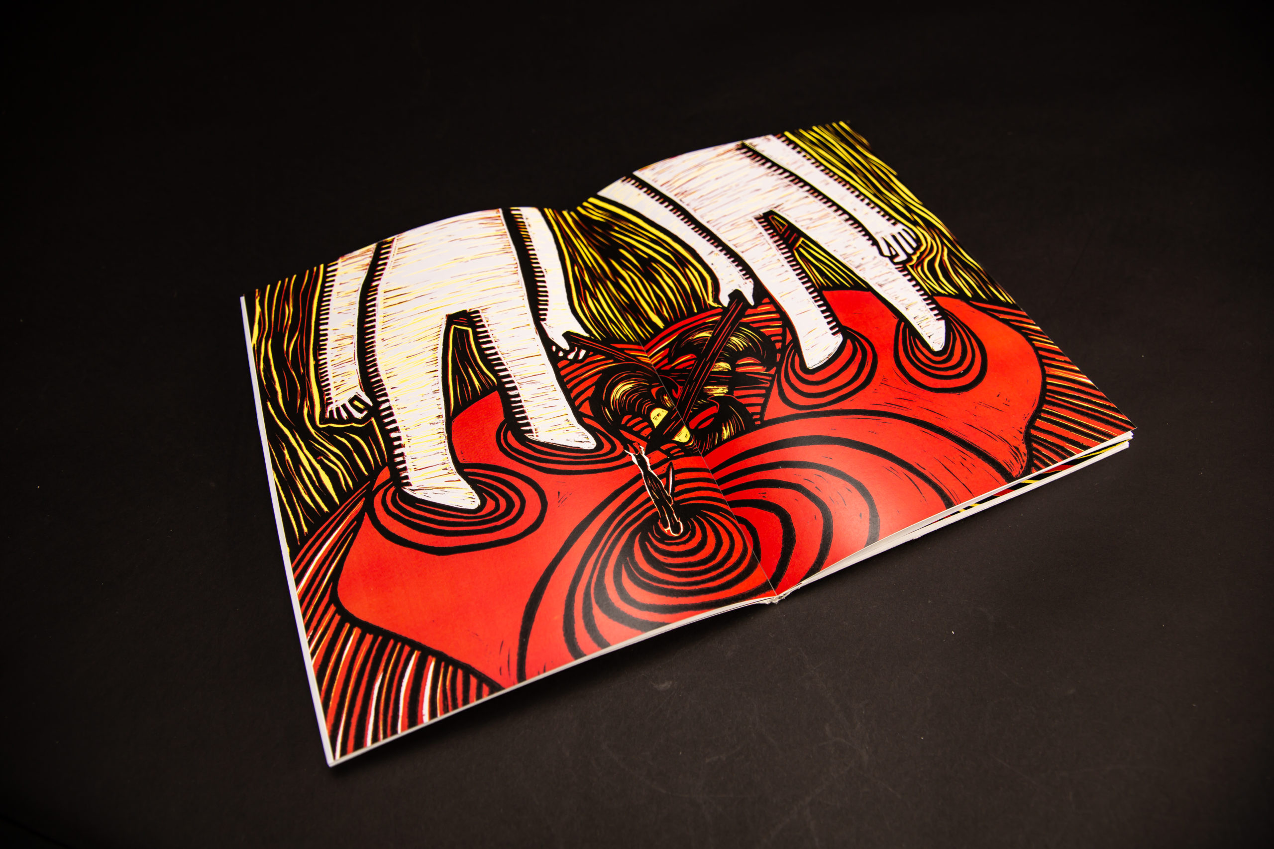
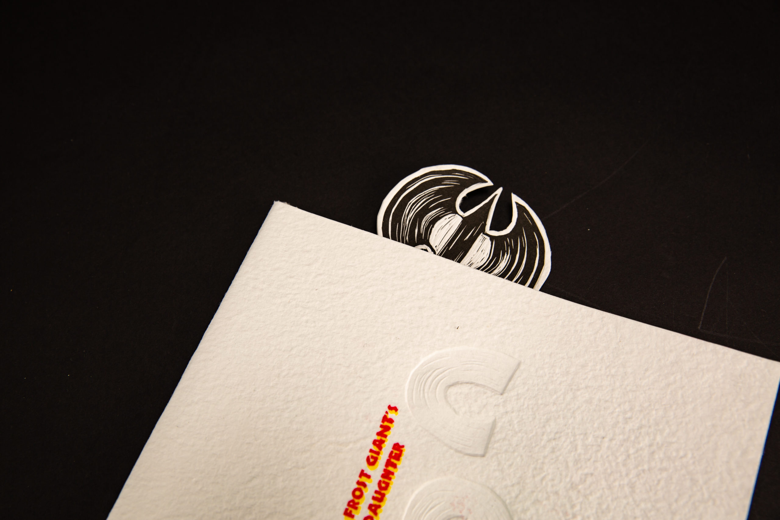
This was a group collaboration project designed by Ju Ping Yeh alongside Luke Tulip and Ho Ming Li. The linocut illustrations designed by Ju Ping Yeh and Ashely Chen. The aim for this project was to design a limited edition book for The Frost Giant’s Daughter by Robert E. Howard.
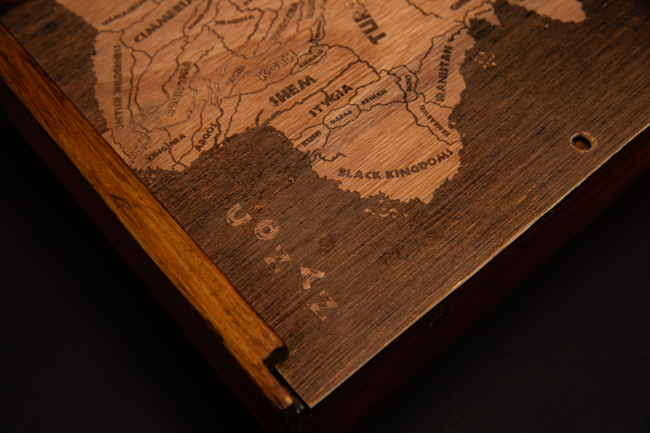
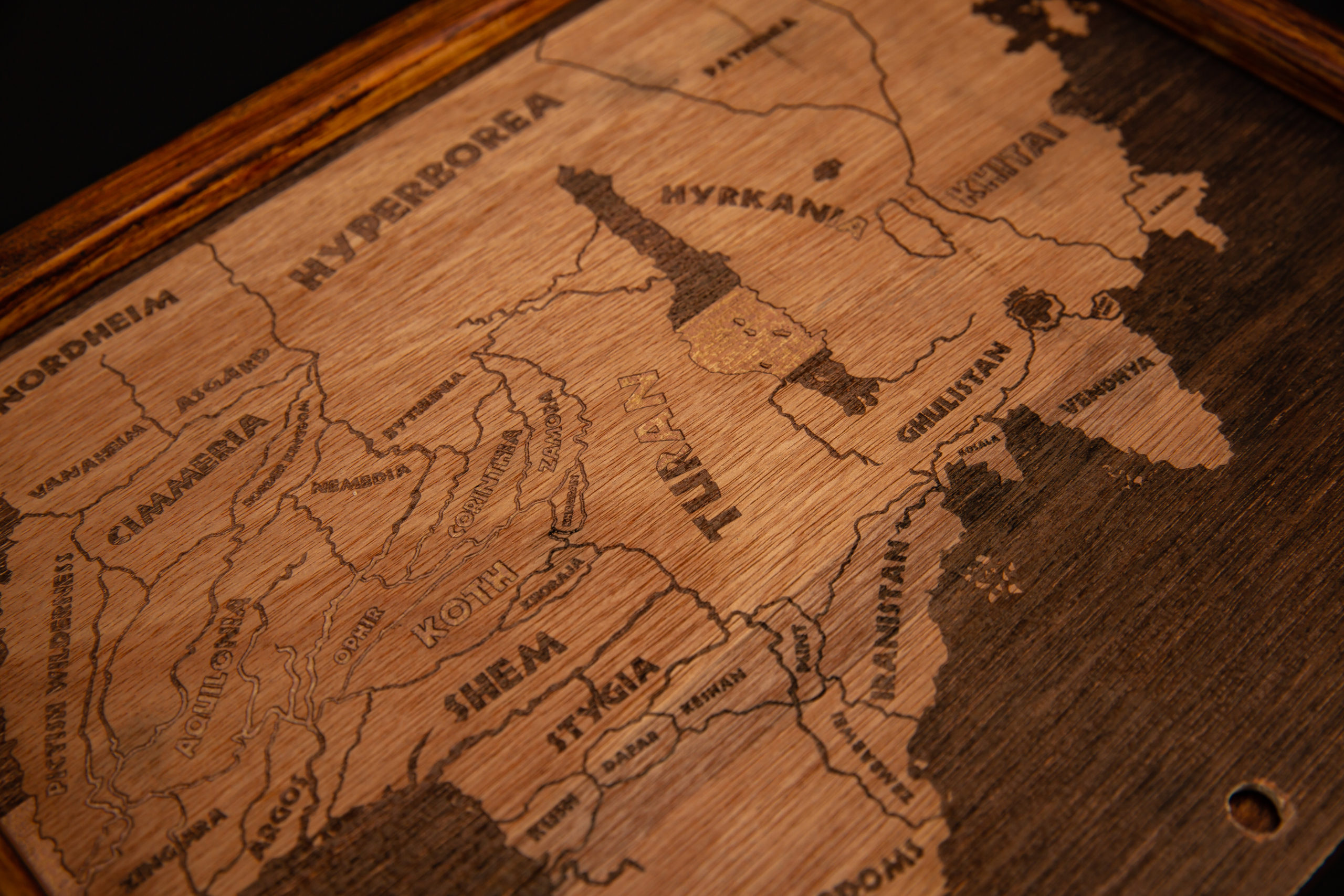
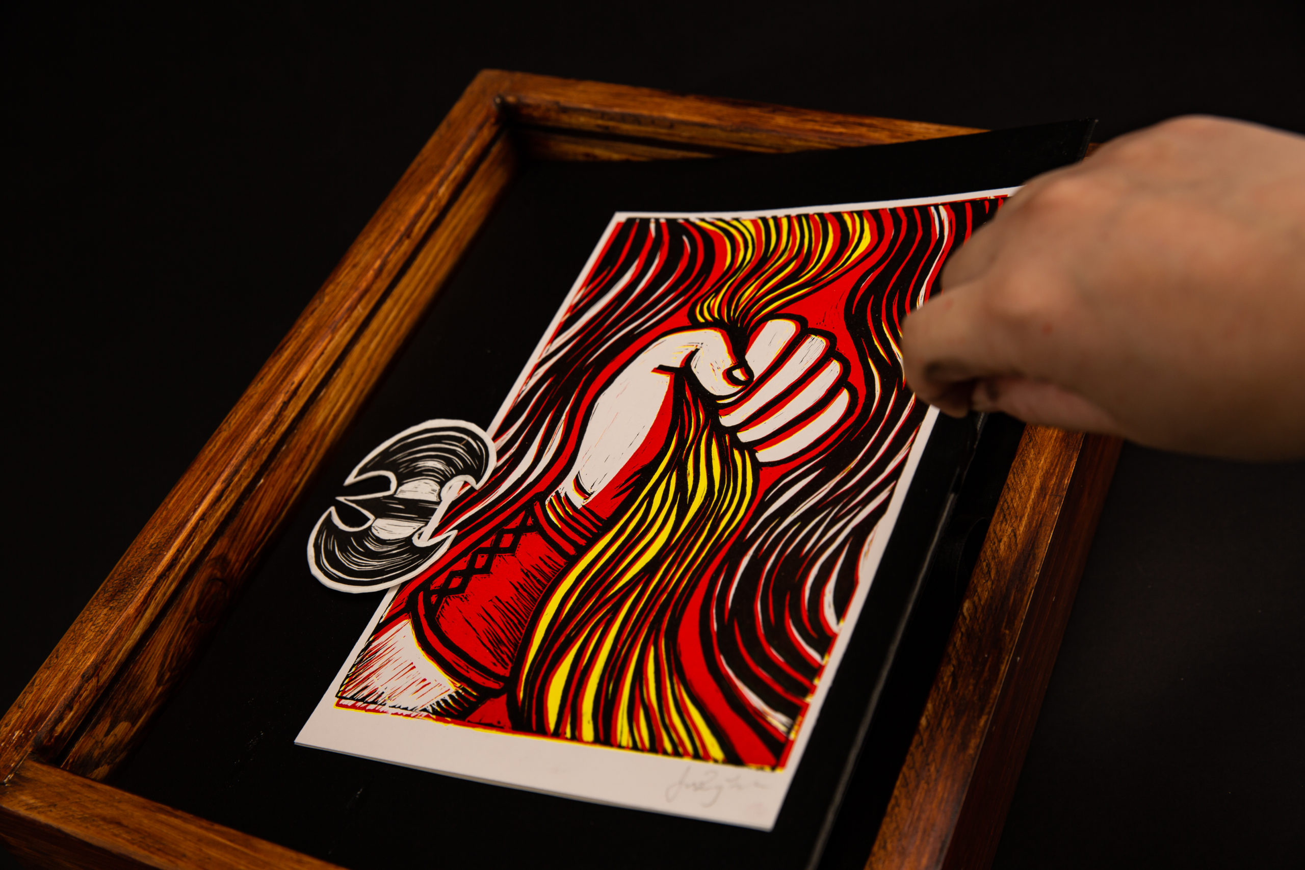
The design is clear and minimal as we’ve carefully selected the size of the images and text appropriately so that they both work in harmony. The cover is hand-made by Ju Ping Yeh to imitate the effects of snow to set the scene of the book’s location. Different editions will continue to be made by hand and will have a different paper texture. The type of binding we have used is perfect bound by hand instead of saddle stitch to allow the gate folds due to the longer paper. This method of binding provides a better finish and allows the user to see the best view of the double page illustrations as the pages open flat. The linocut illustrations designed by Ju Ping Yeh and Ashely Chen were used to reference the 3 colours mention in the book (black, red and yellow). The illustrations appeared regularly to complement the narrative text throughout the book. The colour used in this publication is black, red alongside yellow to represent the Conan’s black hair and the red of Vanaheim and the yellow of Cimmeria. The typeface used in the book is Meridien and Neuland. The body text is a serif typeface name Meridien designed Adrian Frutiger. We decided to use a serif typeface to keep it traditional as it’s used in books and Meridien provides clarity for ease of reading. Neuland is used for the title ‘The Frost Giant’s Daughter’ as we felt that we wanted something bold and blocky. The half title typeface is a linocut print based on the Neuland title typeface.