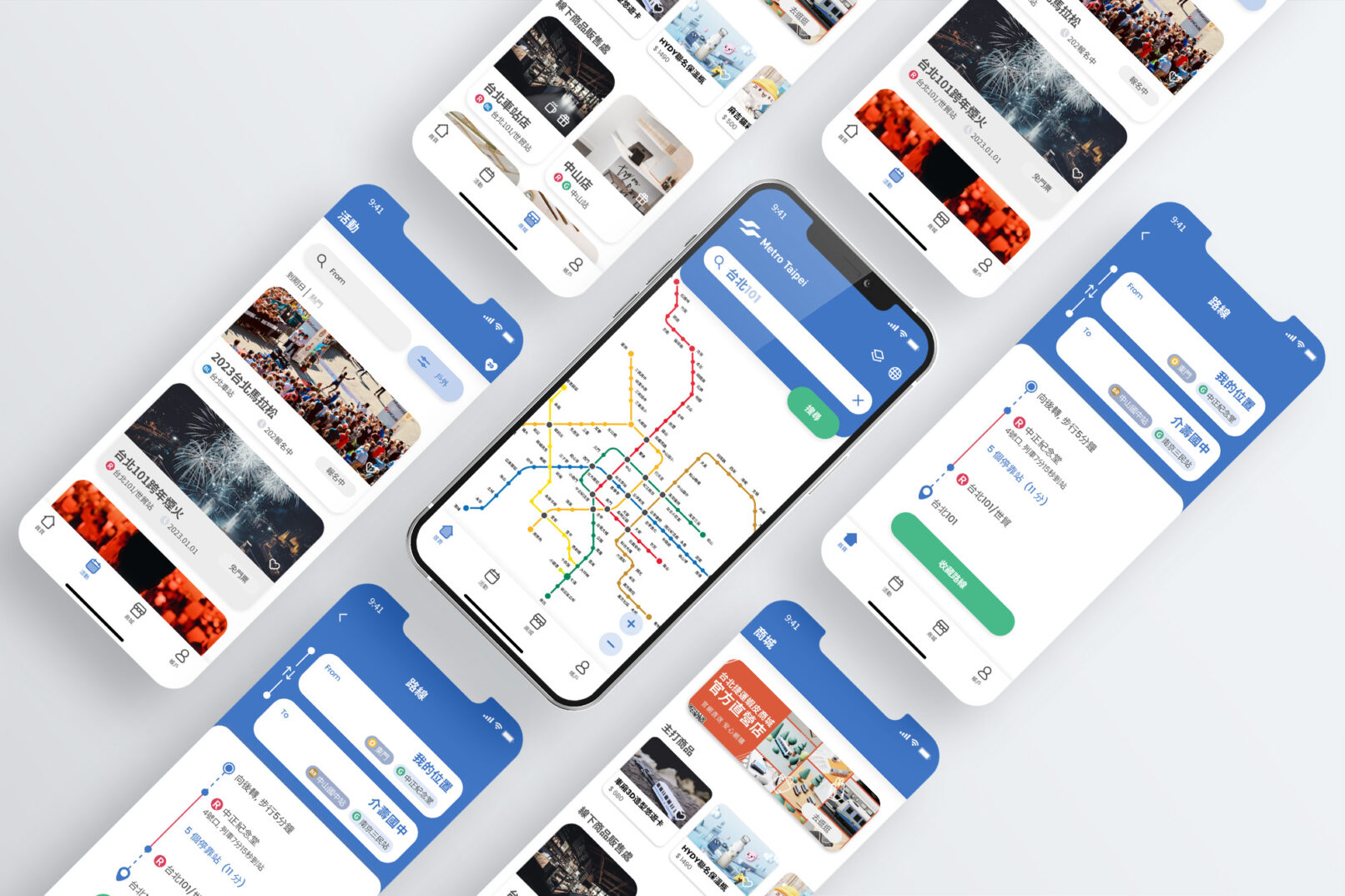
Fun Taipei Metro-Case Study
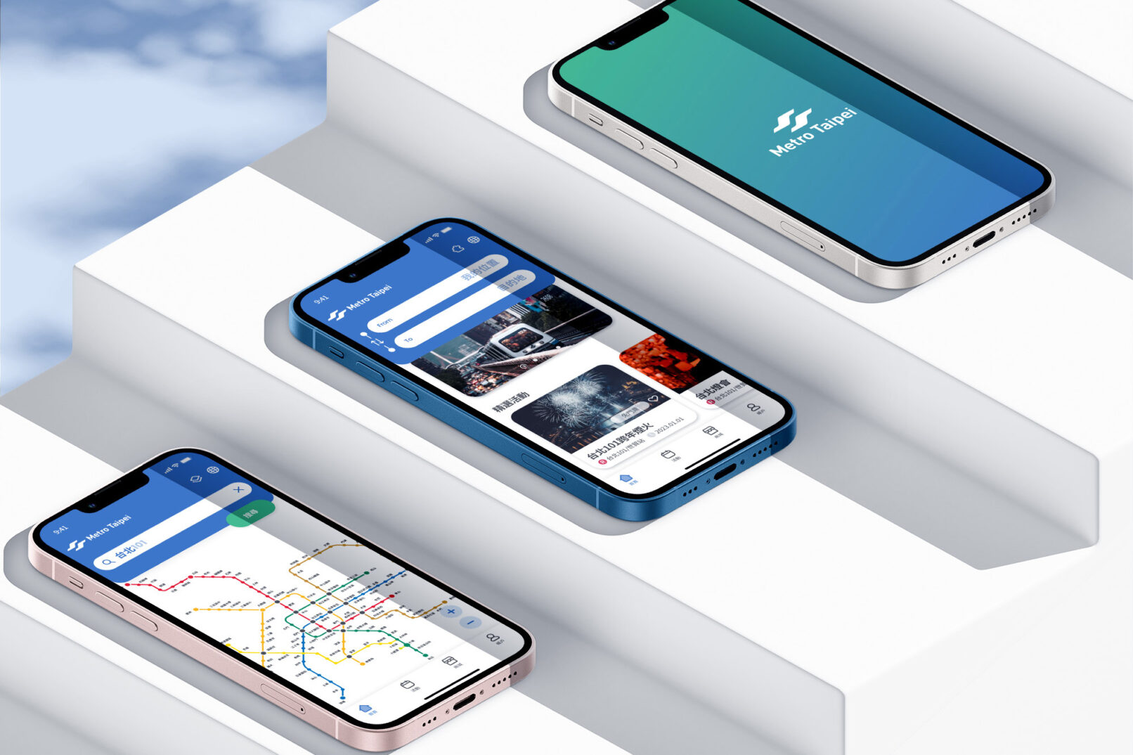
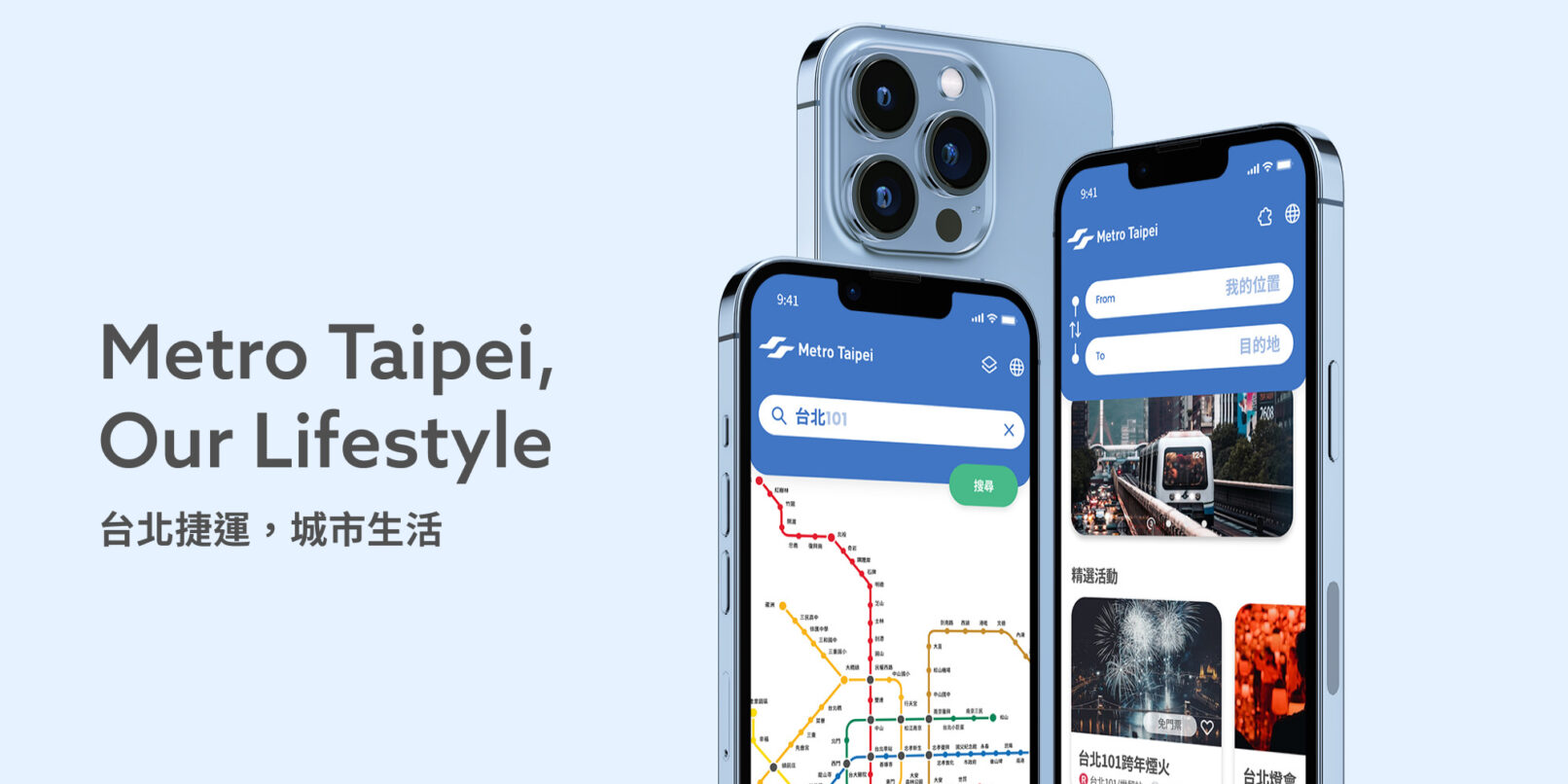
A redesign project for the Taipei Metro App to improve its usability and information.
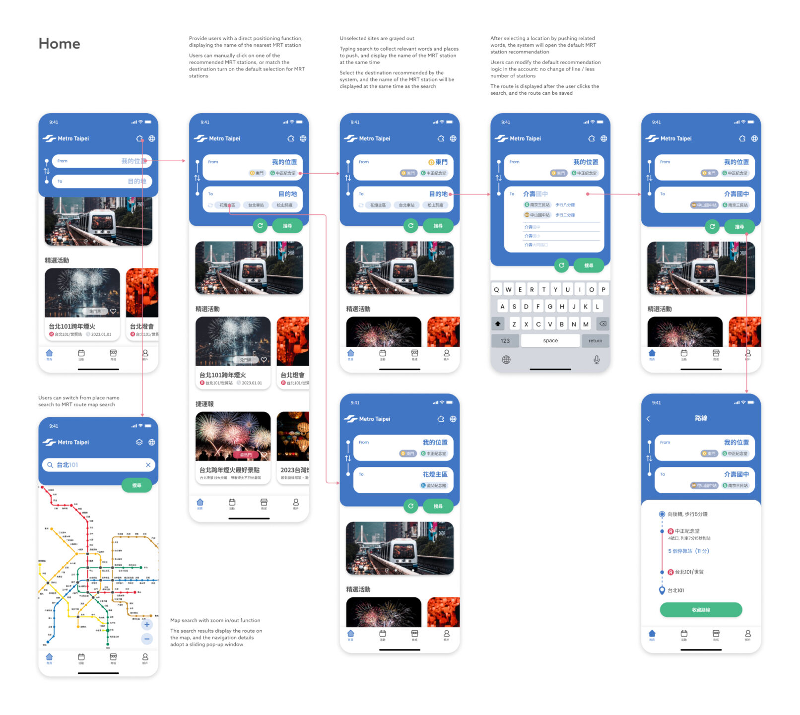
At present, most of the functions of the app can be included in the search system of google map, and for users who are familiar with the route map of Taipei City MRT, the current function of clicking on the map to select a station is not easy to click, and users need to zoom in and out on the map, which is not suitable for Taipei City Familiar tourists may not know where they are near which MRT station. Based on the above user pain points, we hope that the app can extend the use of functions to assist users in itinerary planning, and locate through Taipei free Wifi at each MRT station The location of the user, even cooperates with the data of the mobile phone base station, and cooperates with the activities of Taipei City to launch a route planning service that is strongly bound to the map and activities, so as to distinguish it from Google Maps.
Target audience
- People who would use the app to check the arrival time of trains
- Parents with children (below elementary school age)
- Retired people
Design concept
- For the above-mentioned category 1 users, extend their current usage of the app,
The key point of the design is to extend the original train arrival time out of the itinerary planning
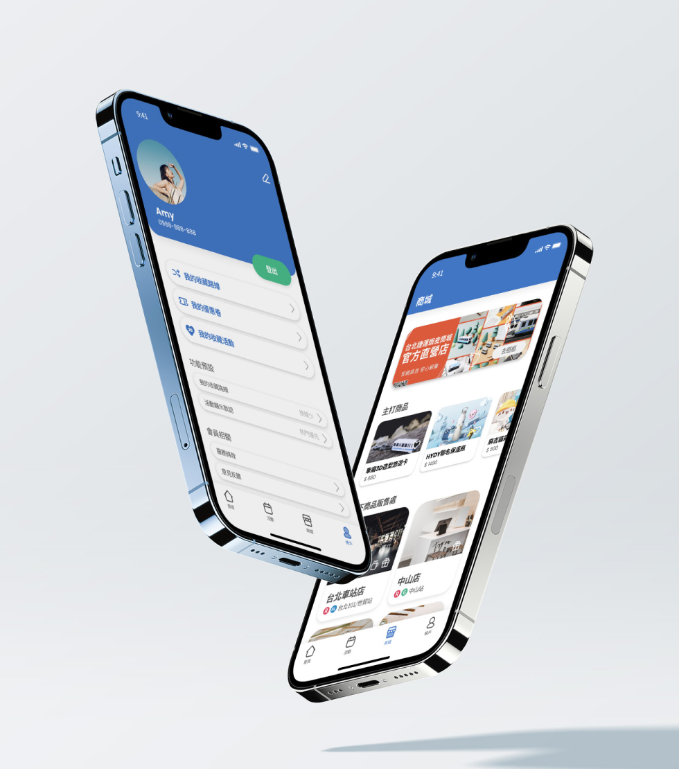
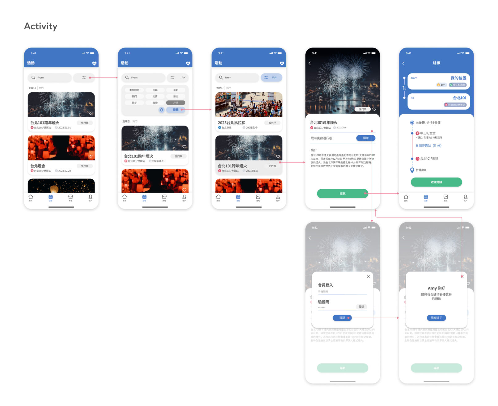
function of - Provide parent-child activity items and venue recommendations for the above-mentioned second group of groups,
Provide route planners with discount coupons provided by third parties to entice them to start
Use the app to arrange parent-child activities on weekends, and at the same time receive information from MRT officials
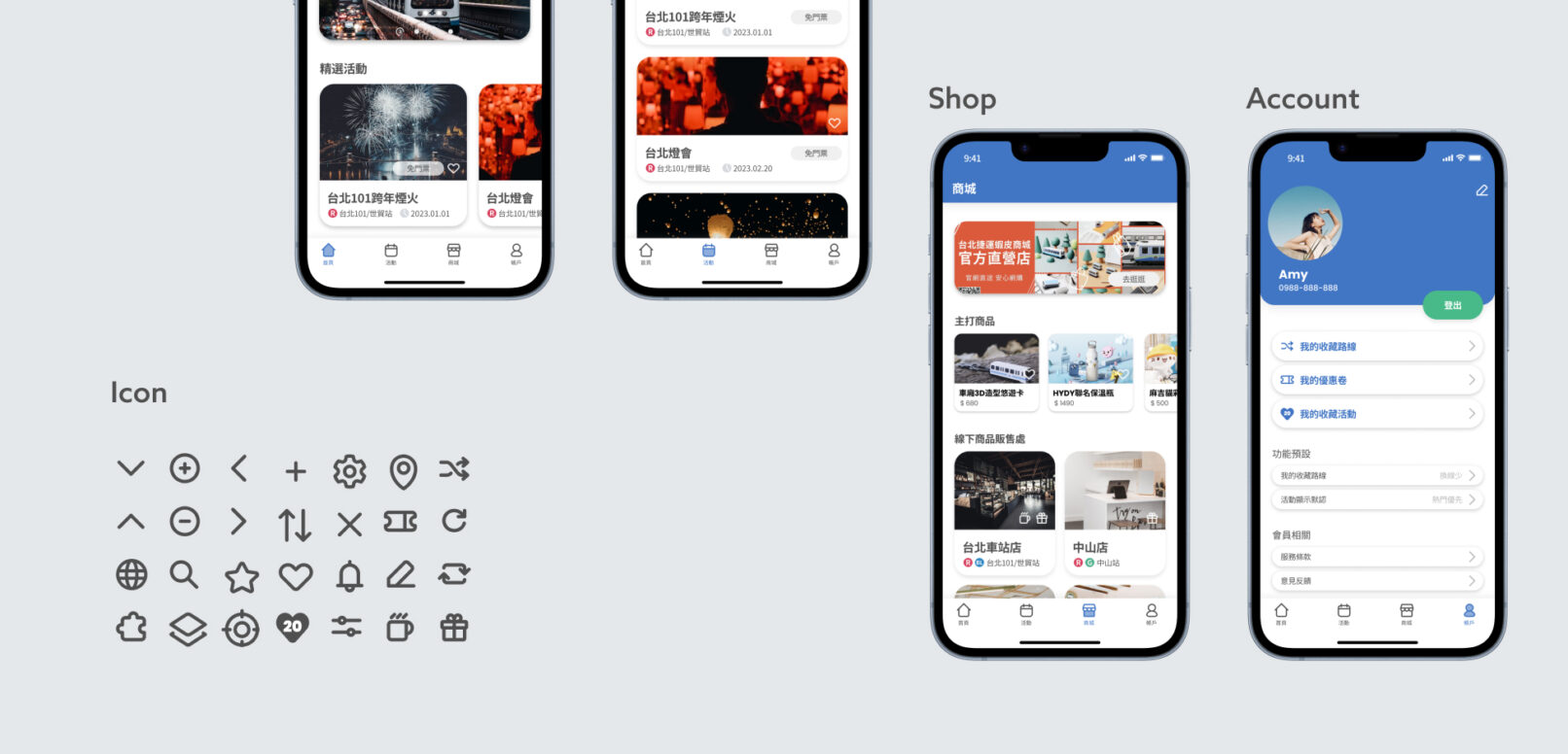
Children’s Toys and Supplies by Fang - Provide a simple operation interface for the above-mentioned third group of groups, including simplified login
method, destination route planning, and reducing the dynamic interference of the page
UI Design | Ju Ping Yeh
UX Design | Freya Ho
Client | Taipei Metro
Date | Feb. 2023

