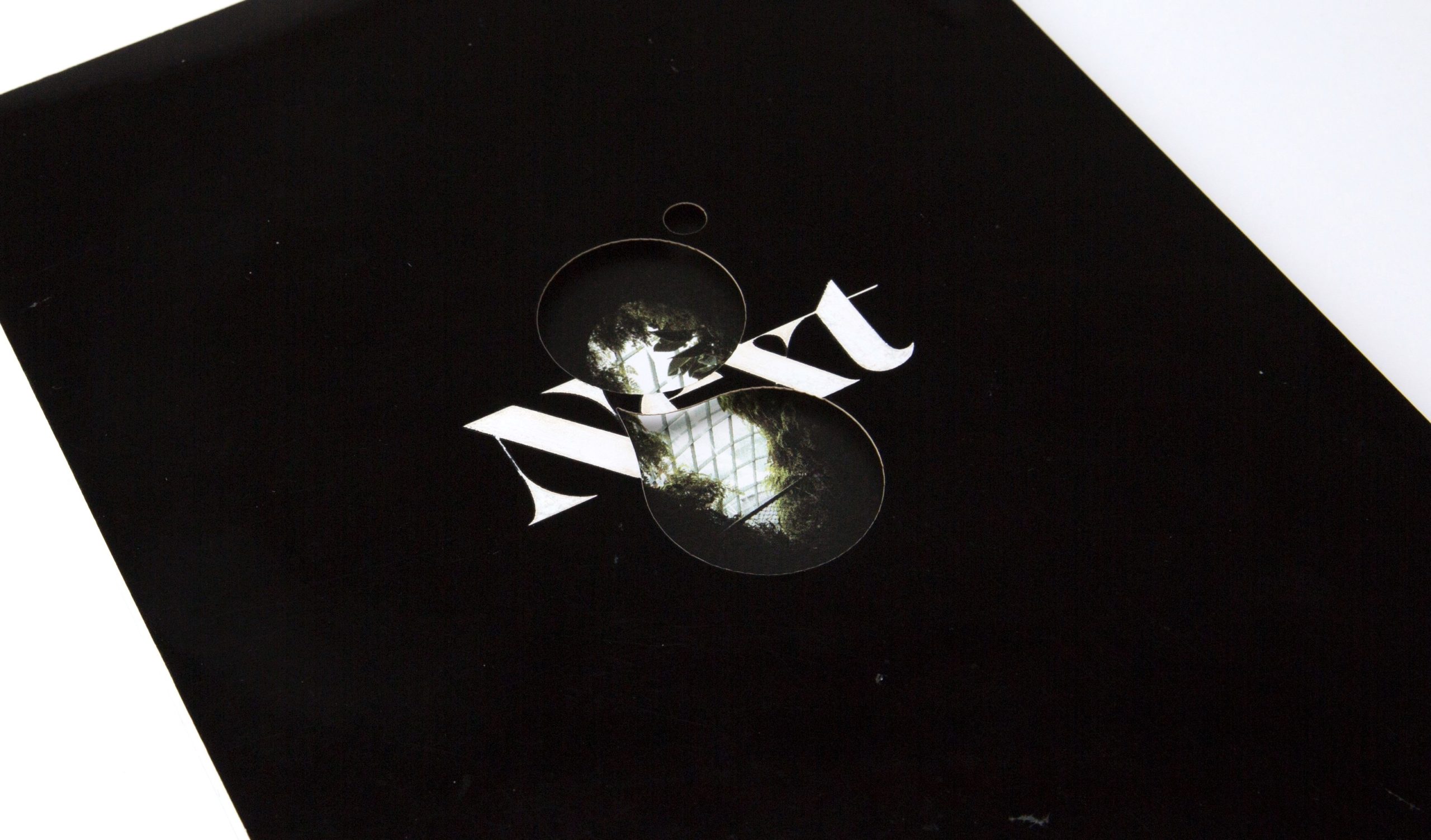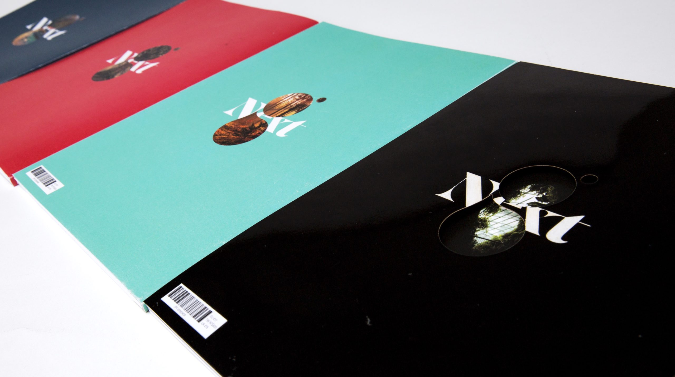
Green
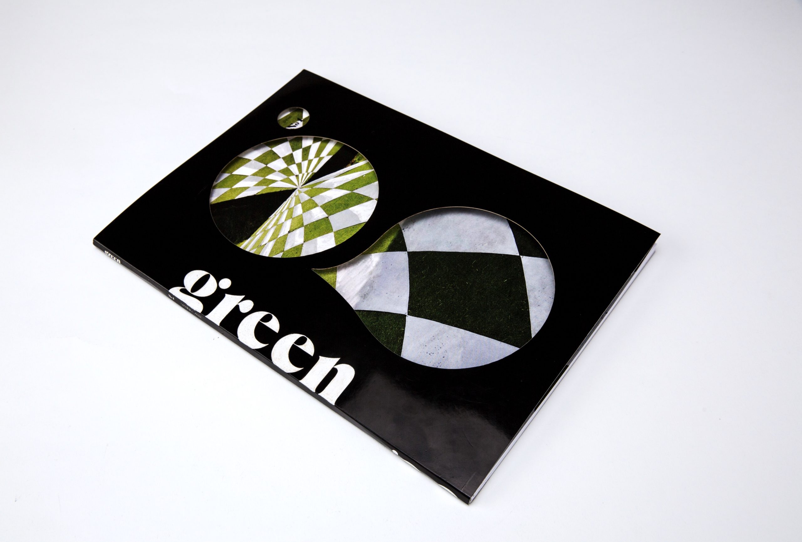
The name of the magazine “green” is want the reader can feel nature and look green. The double page hole want people to look forward discovery more information. When first sketch about cover I really face to a lot of problem. I am too conservative afraid to step up, so I decide to search more sample to inspire me. Moreover, I brainstorm to develop more creative layout. Although I find out what I am going to increase, the sensitive of the typeface is my weakness. The cut of hole “g” I try a lot of design but it is so hard to reach the readability and balance. Fortunately, thank’s for my friend and teacher I find a “g” can present my thought. Furthermore ,the masthead is the typeface mach the “g”.
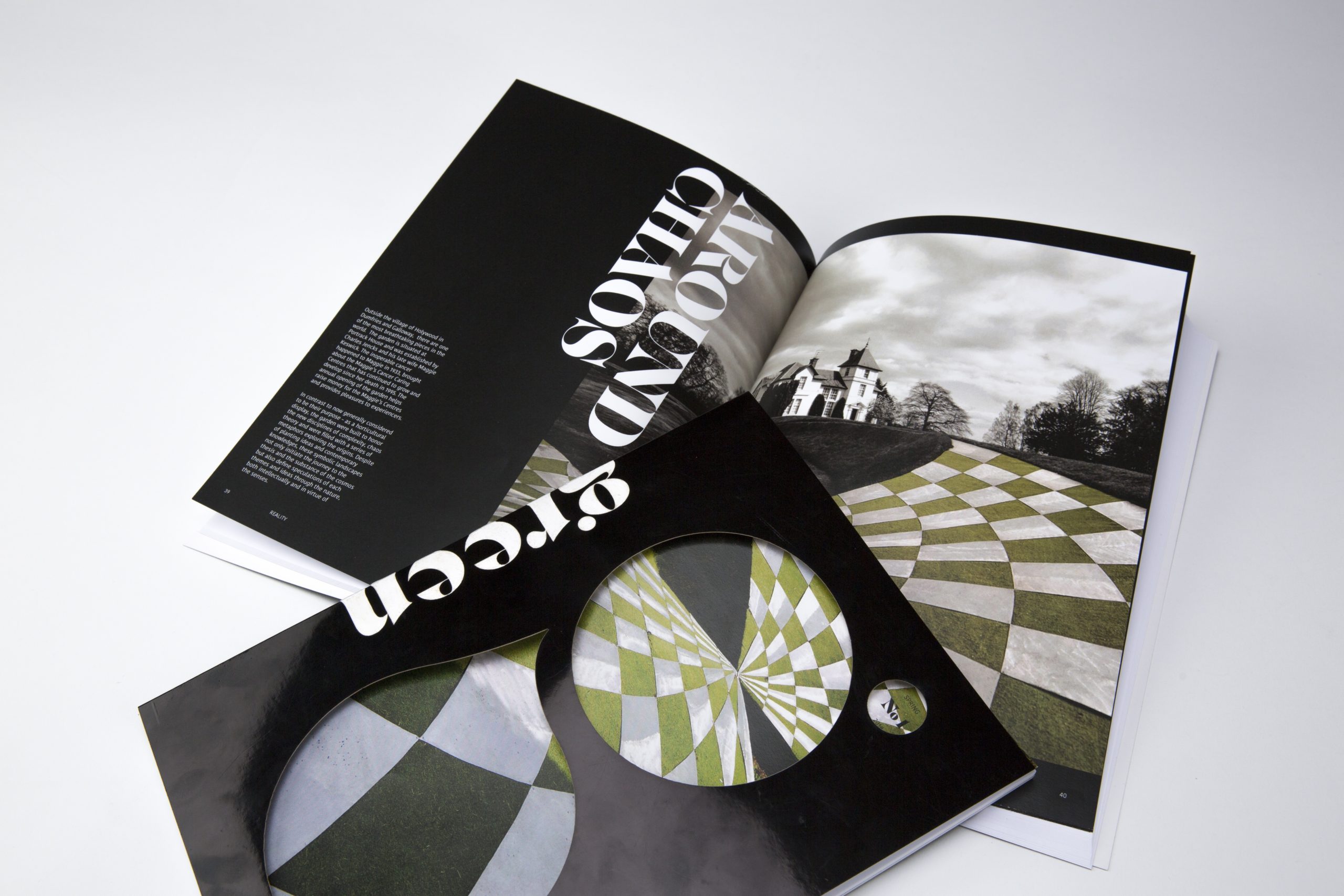
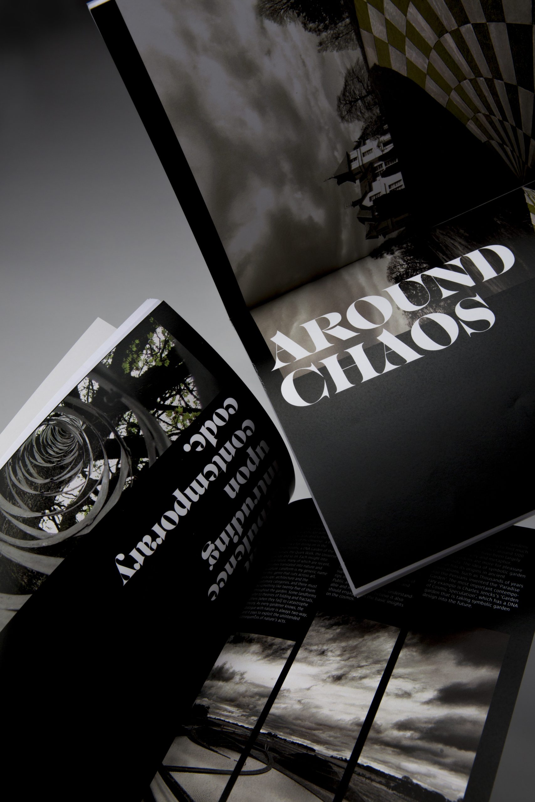
For the topic I chose “Garden of Cosmic Speculation” because it only open once a year and really show the two-way communication between nature and human. Chaos is the main idea of these spread present the begin of universe so let the background turn black. The process of the spread also difficult. The grid really help me to design clearly. The first idea of the layout things look separate and the first spread did not related to next spread and the some of the picture is not attractive enough. Finally I keep my spread clear enough and same style.